identity design
All Seasons, an 18 year old frequently visited restaurant in the western suburbs of Mumbai needed a change in its imagery. How do you change a brand image for an already established entity?
All Seasons
Food & Beverages
2020
A paradigm shift
Isn’t it all in the name
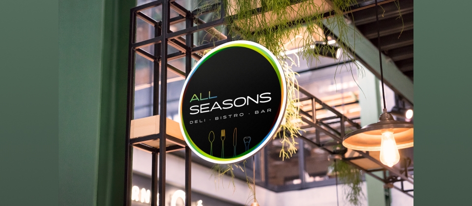
The idea behind a monochromatic logo was to keep it subtle, simple and sophisticated. The 4 coloured lines represent the 4 seasons and the 4 partners who own the restaurant.
The space Strat
An area of 20,000 sq. ft. must be utilized well, especially if it’s a restaurant. Our strategy was to cater the customers of various age groups and target them to specific sub-brands under All Seasons. We segregated All Seasons into three ideas and positioned them distinctively.
Hightight
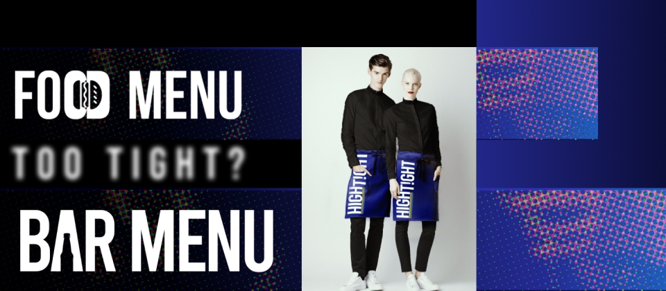
The top floor for the carefree, high spirited and enthusiastic Gen-Z who are young and happening, hence the name.
Tranquil
A perfectly lit area for the families who seek peace looking forward to a serene, joyful and a memorable evening, we thought of Tranquil.
Cliquish
As the name suggests, a classy and sophisticated restaurant & bar for the elite & urbane businessmen from the corporates to crack the ultimate deal.
A Simple Screaming Signage
To instill brand awareness and recall, we fabricated a brightly-lit signage that would grab the eyeballs of Mumbaikars travelling on the western highway. -w/Addition Outdoors
Ta Da! We have a brand born in the new light.


